Survey

In 1868 the South London Gallery was known as Working Men’s College at 91 Blackfriars road. The college moved to larger premises at 143 Kennington Lane in 1878 and a free library was opened there, the first in South London. Exhibitions were organized to be viewed here and private collections of art work were displayed. The Free Library and Art Gallery moved to New Road, Battersea and then to 207 Camberwell Road in 1887.
When the 2nd World War started, the Gallery was turned into a food office. It was severely damaged after the war and the gallery was used just for temporary exhibitions.
In 1992 the gallery became more focused on the latest developments of contemporary art and became known as the South London Gallery. It collected contemporary work related to the South of London. Purchases include works by Antony Gormley, Anish Kapoor and Tracey Emin. The gallery’s profile and visitors grew enormously, and SLG was short-listed in the Prudential Awards for the Arts in 1996.
 |
| How it used to be |
Today the exhibitions continue to gain national and international acclaim, and in October 2003 become an independent charitable trust. In the same year the Arts Council agreed a tenfold increase in revenue funding in recognition of the gallery’s significance as a centre of excellence.
 |
| Development of Project |
The South London Gallery
-
Is an elegant rectangular volume with a large roof light over the centre.
- -The main space cannot be seen from the road.
- - And the narrow corridor which leads to it gives you a sense of surprise when entering a wider space.
These past years the gallery has had had a reputation for its unique education and reaches out to schools and community groups. The activities have grown massively resulting in the need of an extension to the gallery which opened in July 2010. Architects 6A have transformed a neighboring derelict house to create three exhibition spaces, a street facing café, a flat for an artist in residence. At the back of the site is the Clore Studio, a state-of-the-art education and events space which accentuates the SLG's capacity for education and offer activities.
According to the South London Gallery press release, the extension has cost 2million pounds. The biggest challenge 6A architects faced was that they didn’t want the extension to alienate the existing building. Therefore they kept the main structure intact and generated a new design of fully accessible interior and exterior spaces. “Establishing an unexpected and inspiring architectural dialogue between old and new, inside and out.”
Great care was taken to retain the relationship of the domestic environment and the original features within the modern re-building. The new spaces follow the arrangement of the old plan but “the architectural language is abstracted and reduced, as if it were an image through time.”
-
T The timber roof structure has been left exposed and painted white, reminding us of the house’s past derelict state, but also displaying the grander exposed trusses of the main gallery space.
-
-Unity is carried out throughout the building, giving them a distinctive character.
-
-Areas of brickwork have been painted or not touched, tiles have been laid diagonally and an emphasis on light is evident.
-
-The spaces have a maze-like quality, leading visitors to new interesting spaces.
-
-It’s interesting how the location of the gallery is in the heart of an inner city area, between a college of arts and a 1950’s housing estate.
The Clore Studio
-Found at the end of Fox Garden, an oasis of plants designed by Fraser and Morris.
-New building includes two original walls from the lecture theatre and library which was ruined after the World War 2.
-A multifunctional space for use by children and adults for talks and screenings.
-The space hides surprises and in good weather one of the walls opens up, to create a continuous open field with the outside.
-At night the walls and shutters close the whole building down into an abstract dark box.
Our First Impression of the site:
- Makes you feel as though you're looking into someone's house.
- Quite welcoming because of the warm lighting being reflected from the interior.

- Does not feel like a gallery, when concentrating on different parts, different feelings are evoked.
- Can feel like a place to socialise and a place to meet up with friends etc.
- When attempting to look into the upstairs section, you feel uninvolved with what's going on due to the reflective windows because you can't see what's going on inside.
-makes you feel eager to know what is happening inside- it's like a mystery!

- A place that brings people together (cafe).
- Looks like a place to socialise, a cosy environment.
- People look really free and relaxed.
 - Has a traditional facade (Victorian terraced house)which contradicts with parts of the modern interior.
 - There is a reflection of the opposite side of the road on the windows, giving it a very secretive and almost hidden look.
 - The way that a residential house has been transformed into an exhibition space, makes it blend with its surroundings.
- Surprised at its location, a residential location not a commercial area.
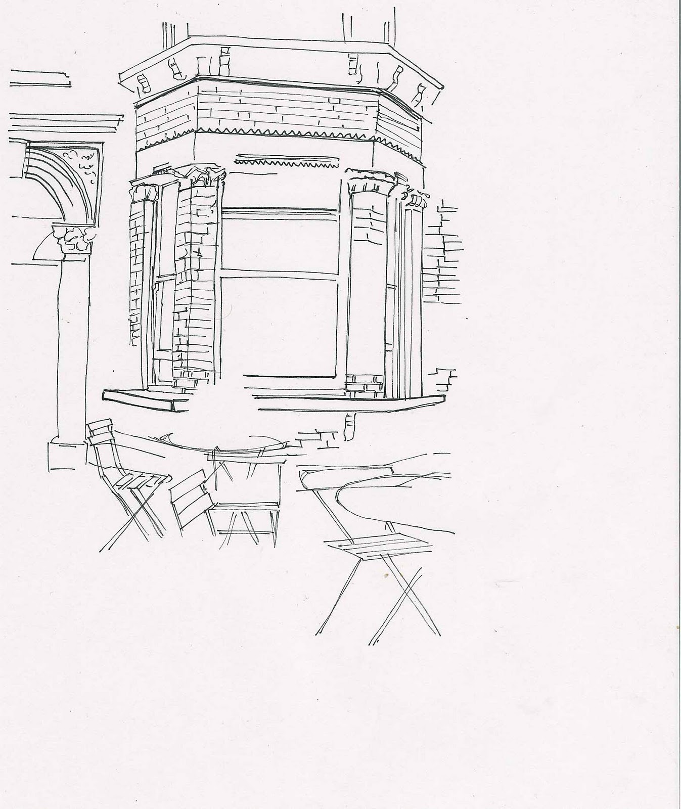
Elevation sketch of extension
Floor plans and section (New extension highlighted in red)

Elevation sketch of extension

Floor plans and section (New extension highlighted in red)


People's opinion about the gallery
1st lady:
1st lady:
'Lives on street opposite the South Gallery extension, so has an emotional touch to it.
It reminds her of her home.
if the building was left to age inside, in the same way it does on the exterior it would be too confusing for an exhibition space.
very striking.
doesn't usually like opened out windows because they look to revealing, however the opened cafe windows work really well because it allows people to look in and out of it'
2nd lady (waitress):
'roof is eco friendly
outside facade resembles a house, but inside is more like an exhibition
evokes different feelings which vary from person to person.'
 Exterior ...
-Underground space looks abandoned, hasn't been taken care of.
-Traditional brick architecture.
-English Victorian Terraced House.
-Smoggy exterior; surface contrasts with the white clean walls inside.
-There is a contrast in the materials used in the exterior and interior.
Abandoned area beside entrance;
Abandoned area beside entrance;
-Makes you feel quite scared because it looks so abandoned and spooky.
 -It's not very welcoming.
-Looks dark and gloomy.
-Looks very old and historical.
-Hasn’t been taken care of- making you wonder why?
-Destroyed, it could have a strong meaning to it, why has it been left out? Why does no onetake care of it?
Walking in...
 White clean walls, makes the place feel and look fresh. Moreover it makes it look more like an exhibition space.
- Outlined features
-Smooth interior
-Floor has been left looking the same as it was in the past
- Floor has a strong wooden smell- complimenting well with the coffee smell
-Idea of keeping the space looking like you are in someone's house
- The cafe is like the kitchen (even has a fire place)
 - Scents from the kitchen invite you inside, smells interact with people
- The full length windows in the cafe space further inside makes it seems like you are sitting outside- bringing the outside into the inside
-Nature is let in
-Calm and relaxing feeling is created
-Minimalistic design. It also looks quite spiritual, lighting, arches, white walls etc.
-White walls makes the space look more open and gives you the ability to see more than you can reach. There is a view of three spaces, when standing in one position.
People's opinions about the interior
People's thoughts and feelings:
 - 'Senses create a connection between people and the house/cafe'
-'Creates an interaction with the space'.
-'Very nice, contrast between inside and outside.'
-'Some would come back again' (live locally)
- 'Idea was to keep it residential'
- 'The area by the kitchen makes you feel like you're in someone's house'
Colour Psychology: (We asked a few people what colour they would choose to represent how the extended part of the gallery made them feel)
-Cafe assistant;
BLUE
Why?
'Versatile. could be lively and calm at the same time'
-Visitor1;
DARK GREEN
Why?
Why?
' Associated to peace, green trees, vivid colours'
-Visitor2
PALE YELLOW
Why?
'Welcoming'
Visitor3-
WHITE
WHITE
Why?
Serene, relaxing
Education centre:
-Used as an education studio.
-On Sundays there are workshops for toddlers to teenagers.
-It has an eco roof.
-Small space and then opens to a large minimalistic space.
-Can hear the sound of footsteps-very quiet.
Upstairs:
-Very simplistic
 -6A architects left the space looking very much like a house, simplistic, old flooring contrasting
 with clean walls.
-6A architects wanted to split the living room and room to make three spaces overall.
-Modern life contrasting with the traditional, old rooms and old flooring put inside.
-Putting the old into the new, around the house it is generally new into old.